WaW Color Play: Soft Summer
[cs_content][cs_section parallax=”false” style=”margin: 0px;padding: 45px 0px;”][cs_row inner_container=”true” marginless_columns=”false” style=”margin: 0px auto;padding: 0px;”][cs_column fade=”false” fade_animation=”in” fade_animation_offset=”45px” fade_duration=”750″ type=”1/1″ style=”padding: 0px;”][cs_text]When summer months come rolling in, the frenzy for garden weddings escalates several notches up. Images of picture perfect afternoon weddings with that gentle breeze complementing the warm sunshine spring to mind. In a country blessed with abundant sun, summer is synonymous to idyllic weddings either set in a garden or by the beach. Wherever the chosen location may be, the wedding palette plays an integral part in nailing that dream wedding.
Pastels have been making headlines in weddings as of late and with good reason. By not sticking to just one color and opting to go for a range of shades, the ladies in the entourage have a freer pick on what to wear. Choosing from any of these shades can actually be fun – pink, cream, light yellow, mint, baby blue, lavender, peach. Different girl, different color, different dress style – all unique, yet when standing side by side each lady is a stand out.
[/cs_text][/cs_column][/cs_row][/cs_section][cs_section parallax=”false” style=”margin: 0px;padding: 45px 0px;”][cs_row inner_container=”true” marginless_columns=”false” style=”margin: 0px auto;padding: 0px;”][cs_column fade=”false” fade_animation=”in” fade_animation_offset=”45px” fade_duration=”750″ type=”1/1″ style=”padding: 0px;”][x_raw_content][/x_raw_content][/cs_column][/cs_row][/cs_section][cs_section parallax=”false” style=”margin: 0px;padding: 45px 0px;”][cs_row inner_container=”true” marginless_columns=”false” style=”margin: 0px auto;padding: 0px;”][cs_column fade=”false” fade_animation=”in” fade_animation_offset=”45px” fade_duration=”750″ type=”1/1″ style=”padding: 0px;”][x_raw_content][/x_raw_content][/cs_column][/cs_row][/cs_section][cs_section parallax=”false” style=”margin: 0px;padding: 45px 0px;”][cs_row inner_container=”true” marginless_columns=”false” style=”margin: 0px auto;padding: 0px;”][cs_column fade=”false” fade_animation=”in” fade_animation_offset=”45px” fade_duration=”750″ type=”1/1″ style=”padding: 0px;”][cs_text]Even the men rock this soft color scheme and never lose a bit of their dapper. Remember what they say, real men wear pink. [/cs_text][/cs_column][/cs_row][/cs_section][cs_section parallax=”false” style=”margin: 0px;padding: 45px 0px;”][cs_row inner_container=”true” marginless_columns=”false” style=”margin: 0px auto;padding: 0px;”][cs_column fade=”false” fade_animation=”in” fade_animation_offset=”45px” fade_duration=”750″ type=”1/1″ style=”padding: 0px;”][x_raw_content][/x_raw_content][/cs_column][/cs_row][/cs_section][cs_section parallax=”false” style=”margin: 0px;padding: 45px 0px;”][cs_row inner_container=”true” marginless_columns=”false” style=”margin: 0px auto;padding: 0px;”][cs_column fade=”false” fade_animation=”in” fade_animation_offset=”45px” fade_duration=”750″ type=”1/1″ style=”padding: 0px;”][x_raw_content][/x_raw_content][/cs_column][/cs_row][/cs_section][cs_section parallax=”false” style=”margin: 0px;padding: 45px 0px;”][cs_row inner_container=”true” marginless_columns=”false” style=”margin: 0px auto;padding: 0px;”][cs_column fade=”false” fade_animation=”in” fade_animation_offset=”45px” fade_duration=”750″ type=”1/1″ style=”padding: 0px;”][cs_text]The thing about pastels is that the colors easily elicit a smile. Take for example this backdrop of giant paper flowers done in a shower of soft summery colors. Any bride and groom standing in front of this enormous backdrop would have no problem smiling happily for the camera. What’s astounding about this multi-colored set is that no matter the number of colors present, since they are done in the palest shades, it doesn’t overshadow the person standing in front. Say cheese! [/cs_text][/cs_column][/cs_row][/cs_section][cs_section parallax=”false” style=”margin: 0px;padding: 45px 0px;”][cs_row inner_container=”true” marginless_columns=”false” style=”margin: 0px auto;padding: 0px;”][cs_column fade=”false” fade_animation=”in” fade_animation_offset=”45px” fade_duration=”750″ type=”1/1″ style=”padding: 0px;”][x_image type=”none” src=”https://weddingsatwork.com/wp-content/uploads/2016/03/backdrop.jpg” alt=”” link=”false” href=”#” title=”” target=”” info=”none” info_place=”top” info_trigger=”hover” info_content=””][/cs_column][/cs_row][/cs_section][cs_section parallax=”false” style=”margin: 0px;padding: 45px 0px;”][cs_row inner_container=”true” marginless_columns=”false” style=”margin: 0px auto;padding: 0px;”][cs_column fade=”false” fade_animation=”in” fade_animation_offset=”45px” fade_duration=”750″ type=”1/1″ style=”padding: 0px;”][cs_text]Source
Pinterest (1)
Pinterest (2)[/cs_text][/cs_column][/cs_row][/cs_section][cs_section parallax=”false” style=”margin: 0px;padding: 45px 0px;”][cs_row inner_container=”true” marginless_columns=”false” style=”margin: 0px auto;padding: 0px;”][cs_column fade=”false” fade_animation=”in” fade_animation_offset=”45px” fade_duration=”750″ type=”1/1″ style=”padding: 0px;”][cs_text]The bride’s bouquet with varying shades of pastels creates a truly sigh-worthy image. Against the pristine white of her wedding gown, these flowers present that subtle and elegant touch without ever becoming loud and obtrusive. When a bride walks down the aisle holding her bouquet of soft pastel flowers, she effortlessly looks like a goddess.
[/cs_text][/cs_column][/cs_row][/cs_section][cs_section parallax=”false” style=”margin: 0px;padding: 45px 0px;”][cs_row inner_container=”true” marginless_columns=”false” style=”margin: 0px auto;padding: 0px;”][cs_column fade=”false” fade_animation=”in” fade_animation_offset=”45px” fade_duration=”750″ type=”1/1″ style=”padding: 0px;”][x_raw_content][/x_raw_content][/cs_column][/cs_row][/cs_section][cs_section parallax=”false” style=”margin: 0px;padding: 45px 0px;”][cs_row inner_container=”true” marginless_columns=”false” style=”margin: 0px auto;padding: 0px;”][cs_column fade=”false” fade_animation=”in” fade_animation_offset=”45px” fade_duration=”750″ type=”1/1″ style=”padding: 0px;”][x_raw_content][/x_raw_content][/cs_column][/cs_row][/cs_section][cs_section parallax=”false” style=”margin: 0px;padding: 45px 0px;”][cs_row inner_container=”true” marginless_columns=”false” style=”margin: 0px auto;padding: 0px;”][cs_column fade=”false” fade_animation=”in” fade_animation_offset=”45px” fade_duration=”750″ type=”1/1″ style=”padding: 0px;”][cs_text]When it comes to cakes, combining the varying shades of pastel in one delectable creation often give the fun touch to the wedding reception. Going against the grain of traditional single colored wedding cakes reflect the cheery and cool personalities of the couple. And it’s not just the colors you can play around with. Even the kind of cake itself makes for some delicious adventures. A macaroon tower bedecked with pastel colored sugar flowers doubles up as wedding cake and dessert centerpiece. Now what better way to celebrate your union that with this incredible treats.
[/cs_text][/cs_column][/cs_row][/cs_section][cs_section parallax=”false” style=”margin: 0px;padding: 45px 0px;”][cs_row inner_container=”true” marginless_columns=”false” style=”margin: 0px auto;padding: 0px;”][cs_column fade=”false” fade_animation=”in” fade_animation_offset=”45px” fade_duration=”750″ type=”1/1″ style=”padding: 0px;”][x_raw_content][/x_raw_content][/cs_column][/cs_row][/cs_section][cs_section parallax=”false” style=”margin: 0px;padding: 45px 0px;”][cs_row inner_container=”true” marginless_columns=”false” style=”margin: 0px auto;padding: 0px;”][cs_column fade=”false” fade_animation=”in” fade_animation_offset=”45px” fade_duration=”750″ type=”1/1″ style=”padding: 0px;”][x_raw_content][/x_raw_content][/cs_column][/cs_row][/cs_section][cs_section parallax=”false” style=”margin: 0px;padding: 45px 0px;”][cs_row inner_container=”true” marginless_columns=”false” style=”margin: 0px auto;padding: 0px;”][cs_column fade=”false” fade_animation=”in” fade_animation_offset=”45px” fade_duration=”750″ type=”1/1″ style=”padding: 0px;”][cs_text]On the tables, flowers in light shades contribute to a quaint ambiance. Going for rustic touches such as wooden boards and boxes highlight the delicate colors of the blooms. Combing different flowers with different changes enhance the carefree mood of the centerpiece. When guests are surrounded by this happy ambiance, beautiful memories are freely created. [/cs_text][/cs_column][/cs_row][/cs_section][cs_section parallax=”false” style=”margin: 0px;padding: 45px 0px;”][cs_row inner_container=”true” marginless_columns=”false” style=”margin: 0px auto;padding: 0px;”][cs_column fade=”false” fade_animation=”in” fade_animation_offset=”45px” fade_duration=”750″ type=”1/1″ style=”padding: 0px;”][x_raw_content][/x_raw_content][/cs_column][/cs_row][/cs_section][cs_section parallax=”false” style=”margin: 0px;padding: 45px 0px;”][cs_row inner_container=”true” marginless_columns=”false” style=”margin: 0px auto;padding: 0px;”][cs_column fade=”false” fade_animation=”in” fade_animation_offset=”45px” fade_duration=”750″ type=”1/1″ style=”padding: 0px;”][x_raw_content][/x_raw_content][/cs_column][/cs_row][/cs_section][cs_section parallax=”false” style=”margin: 0px;padding: 45px 0px;”][cs_row inner_container=”true” marginless_columns=”false” style=”margin: 0px auto;padding: 0px;”][cs_column fade=”false” fade_animation=”in” fade_animation_offset=”45px” fade_duration=”750″ type=”1/1″ style=”padding: 0px;”][cs_text]With pastels as the background, weddings take on a joyful atmosphere. Gone are the stiffness and stuffiness of the traditional ways. Soft, delicate shades in a wedding lend an understated elegance yet make room for casualness to abound. And when all the cake has been eaten and the dresses returned to the closet, the shoes stowed away, the memories of that light and cheerful summer day are all that remains, those beautiful soft shades come to life. Good memories they are indeed.
So what’s your summer color? Share with us!
Read more of Tisha Rosales’ Color Play articles at www.weddingsatwork.com/category/color-play/.[/cs_text][/cs_column][/cs_row][/cs_section][cs_section parallax=”false” style=”margin: 0px;padding: 45px 0px;”][cs_row inner_container=”true” marginless_columns=”false” style=”margin: 0px auto;padding: 0px;”][cs_column fade=”false” fade_animation=”in” fade_animation_offset=”45px” fade_duration=”750″ type=”1/1″ style=”padding: 0px;”][cs_block_grid type=”two-up”][cs_block_grid_item title=”Block Grid Item 1″]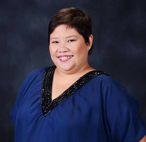 [/cs_block_grid_item][cs_block_grid_item title=”Block Grid Item 2″]About WaW Color Play Columnist Tisha Rosales: Tisha is a Meta-Coach, events professional, freelance writer and candle artisan of Balay Kandila.
She’s also mom to 3 boys.
In between projects, she blogs on www.thoughtscribbler.com.[/cs_block_grid_item][/cs_block_grid][/cs_column][/cs_row][/cs_section][/cs_content]